Introduction
If you own or manage a moving company, your website is one of your most valuable business assets. For many potential customers, it’s the first impression they have of your brand. A well-structured website can generate a steady stream of qualified leads, while a cluttered or confusing one will push visitors to your competitors in seconds.
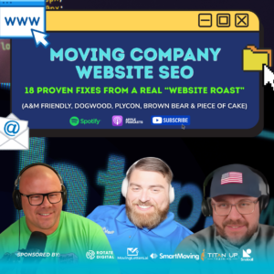
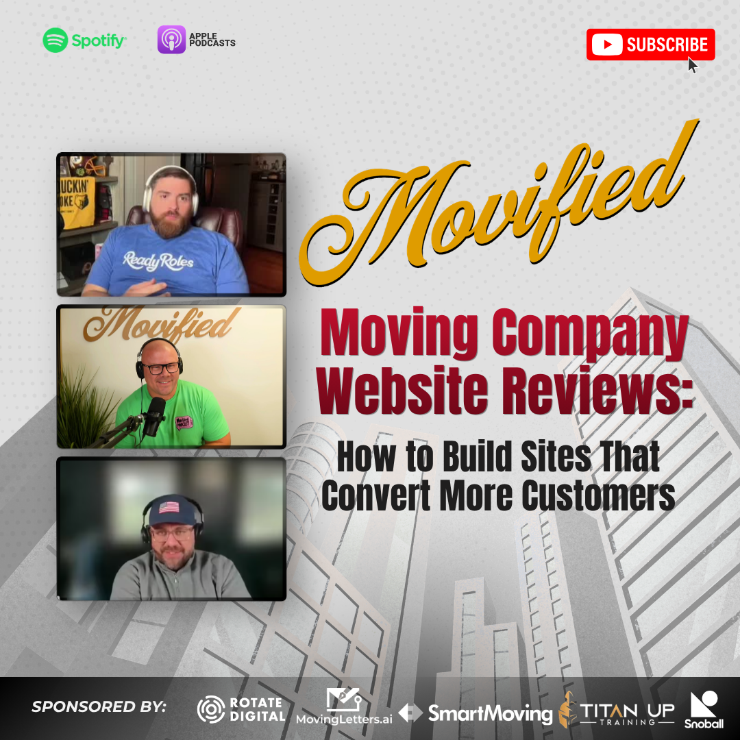
In a special episode of the Movified Podcast, host Mark Hirschi (Salmon’s Moving & Storage, Vancouver BC) sat down with Brian Slater and Stephen Reed to perform live moving company website reviews. They broke down what works, what doesn’t, and how even small adjustments can dramatically increase conversions.
This blog post distills their insights into a practical guide for moving company owners, franchisees, and industry professionals. You’ll learn exactly what to prioritize when designing or updating your site, and how to turn web visitors into booked jobs.
Key Takeaways
What You’ll Learn:
- Customers judge your site in under 5 seconds—above-the-fold design is critical.
- Use a geo-specific H1 headline (e.g., “Boston Movers”) for SEO strength.
- Navigation should be simple: Services, Locations, Contact.
- Embed quote forms where customers can see them immediately.
- Trust signals like reviews, star ratings, and awards build credibility.
- Optimize for mobile-first browsing—90% of moving leads come from phones
- Track behavior with tools like Hotjar heatmaps and Google Analytics.
Table of Contents
- Why Moving Company Website Reviews Matter
- Above-the-Fold Fixes: What Customers See First
- Navigation and User Experience Tips
- Forms That Convert: From Quotes to Calls
- Trust Signals: Reviews, Logos, and Proof
- Case Studies: Good, Bad, and Excellent Sites
- Why Choose Movified for Insider Insights
- Conclusion: Your Website Is Your Digital Doorway
Why Moving Company Website Reviews Matter
Your website is not just a digital business card. It’s the sales engine of your moving company. Customers searching online are stressed, time-constrained, and looking for fast reassurance. If your site doesn’t communicate professionalism and ease of booking immediately, you lose them.
In the podcast, Brian Slater explained how small design changes can lead to massive performance gains. Adjusting font size, re-labeling buttons, and restructuring quote forms improved his own site’s conversion rate by double digits.
The reality is simple: Design equals trust. A clean, modern, mobile-optimized website convinces customers that you’ll handle their move with the same professionalism.
Above-the-Fold Fixes: What Customers See First
Why “above the fold” matters
Most visitors never scroll down. That means the top section of your homepage carries the entire weight of convincing them to stay.
Must-have elements above the fold
- H1 headline with geo keyword: Example: “Trusted Las Vegas Movers | Muscle Movers”.
- Primary CTA button: “Get a Quote Now” or “Call Today.”
- Embedded short form: Name, Phone, Email, ZIP to ZIP.
- Hero image or video: Your own branded trucks and crews—not stock photos.
- Trust signal: Star rating, Google badge, or testimonial snippet.
“Most users never scroll below the fold. If your core message and form aren’t visible, you’re losing leads.” – Brian Slater
Navigation and User Experience Tips
Navigation is your customer’s map. If the menu is confusing, they’ll leave. The reviews uncovered a few universal best practices.
Do’s
- Keep Services, Locations, and Contact in the top nav.
- Place money pages (Quotes, Services) to the left—people read left to right.
- Use dropdowns for secondary items (About Us, Careers, FAQs).
- Make the nav bar static, following users as they scroll.
Don’ts
- Don’t duplicate “Services” and “Service Areas.” Rename as “What We Do” and “Locations.”
- Don’t bury core services under niche ones (e.g., “Senior Citizen Movers” above “Local Movers”).
- Don’t swap menus between site sections. Consistency creates trust.
Forms That Convert: From Quotes to Calls
The podcast team emphasized that forms make or break conversions. A poorly structured form frustrates visitors, while a streamlined one generates qualified leads.
Form best practices
- Keep it short: ZIP to ZIP is enough for estimates.
- Order fields logically: Name → Phone → Email → Move Details.
- Use conditional logic: If “Realtor” is selected, show “Realtor Name.”
- Mark mandatory fields with asterisks.
- Offer both: a form and a call option.
“Nine form fills happen for every one call. If you only provide a phone number, you’re missing business.” – Brian Slater
Trust Signals: Reviews, Logos, and Proof
Trust is the foundation of the moving industry. Customers want assurance before booking.
Trust signal strategies
- Replace “Write a Review” with a Google review carousel.
- Use familiar logos (Google, Yelp, BBB) instead of obscure seals.
- Showcase awards without outdated years. Say “Multi-Year Winner” instead of “Winner 2022.”
- Display branded trucks, uniformed movers, and real customer photos.
Case Studies: Good, Bad, and Excellent Sites
The team reviewed several real-world moving websites. Here are highlights:
Lifetime Moving Co. (Massachusetts)
- A+ hero video showing movers in action.
- Bright orange CTA contrasts against blue theme.
- Clean, simple services menu.
- Attribution field: “How did you find us?”
Verdict: Excellent example of above-the-fold design.
Higher Ground Moving (Bend, OR)
- Outdated navigation style.
- “Write a Review” button front-and-center hurts trust.
- Generic field hero image instead of trucks.
Verdict: Needs modernization.
Eager Beaver Moving (Edmonton, AB)
- Memorable mascot branding.
- Strong e-commerce section (“Beaver Bundles”).
- Consistency across trucks, uniforms, and site.
Verdict: 4.3 out of 5—professional and creative.
True Friends Moving (Nashville, TN)
- Strong branding and color consistency.
- Innovative AI “Connect” widget for text/call/email.
- Needs stronger above-the-fold form.
Verdict: 4.5 out of 5—excellent branding with room to grow.
Trent Relocation (Tennessee)
- Smart layout: video left, form right.
- Move size options too detailed—can confuse.
- Trust badges unfamiliar—should use Google/Yelp.
- Awards should avoid outdated years.
Verdict: Strong design with critical areas for improvement.
Why Choose Movified for Insider Insights
At Movified, we specialize in creating resources that help movers grow. Our podcast features real owners and operators, sharing unfiltered lessons about websites, sales, SEO, and customer experience.
With decades of combined moving industry experience, we know what drives results. Whether it’s creating better websites, writing stronger job ads, or optimizing dispatch systems, Movified provides battle-tested strategies, not theory.
Conclusion
Your moving company website is your digital doorway. It shapes customer impressions, guides them to action, and directly impacts revenue. If it’s outdated or confusing, you’re losing leads every day. But by applying the insights from these moving company website reviews—clear H1s, simplified navigation, quick forms, and visible trust signals—you can transform your site into a conversion machine.
“Don’t drive $50,000 worth of ad traffic into a $1,000 website. Invest in the front door of your business.” – Brian Slater

Meet The Host
Mark Hirschi is the founder and host of Movified. With over a decade in the moving and storage industry, Mark combines real-world leadership experience with a passion for mentorship and elevating industry standards.